5 Points to Consider While Designing a Logo for Your Brand
Close your eyes and imagine your favourite food. What’s the first thing that pops into your mind? Is it the smell of the dish? It’s texture on your tongue? Or would it be the way it looks? Most people pick answer number 3 and for good reason. Around 30% to 40% of our cerebral cortex is used for vision, as opposed to a mere 3% for hearing and 8% for our sense of touch. Due to this, 80% of what we feel is influenced by what we see. This implies that human beings are more influenced by visual cues than other other sensory cues. An experiment that best illustrates this was conducted by Ph.D. student Frederic Brochet. In 2001, he dyed a white wine red and gave it to wine science students. 97% of the students were fooled into believing they were drinking red wine!
So what does this have to do with designing a logo?
Keeping all this in mind, one can’t help but ponder over the importance of visual cues in influencing the perceptions of people. Even when it comes to branding and consumer behaviour, there is proof that consumers are significantly impacted by the visual aspects of a brand more than any other aspect. And, arguably, the most visible element of any brand’s visual identity is the logo. Recent reports show that a brand logo is used by customers for identification, differentiation, and positive associations with the brand. Think about Apple, Nike or Samsung. What’s the first thing that comes to your mind? It’s most probably going to be the bitten apple, the tick mark and the word ‘Samsung’ written in blue. A brand’s logo is important to effectively express the core values of your company/product. Let’s look at 5 points to consider while designing a logo for your brand.
1) Is it a true expression of your brand: Does it cue your brand’s values/ purpose? Does it illustrate your brand’s personality?
“Content precedes design. Design in the absence of content is not design, it’s decoration.”- Jeffrey Zeldman
A good logo design is content-focused. It represents the values of your brand. Before creating a logo, note down your brand’s purpose, values, and core messages. Who are you? What do you want to express? How do you want people to view your brand? After this, note down your target audience. Who is going to buy your product? What do they care about? Essentially, you have to decide on what you want to say, who you want to say it to and how to effectively communicate these messages through your logo design.
This includes elements such as visuals, colour, font, typography, etc., through which you will be expressing vital information about your company. For example, the logo of Cafe Coffee Day is simple, yet effectively expresses their core message. Their red inverted comma conveys their main tagline, which is that time spent over a cup of coffee can stimulate interesting conversations. Simple, direct and truly representative of their core message.
Creating a logo based around the brand’s values also helps in invoking specific feelings in your audience. When you see the two sparring crimson bulls in the Redbull logo, you feel a sense of power and energy. The Ralph Lauren logo, a man mounted on a horse playing polo, gives a feeling of opulence and class. The MTV logo was one of the first logos to be created digitally and was considered to be quite modern then. This is expressed through its design, which looks unique when compared to their competitors at that time.
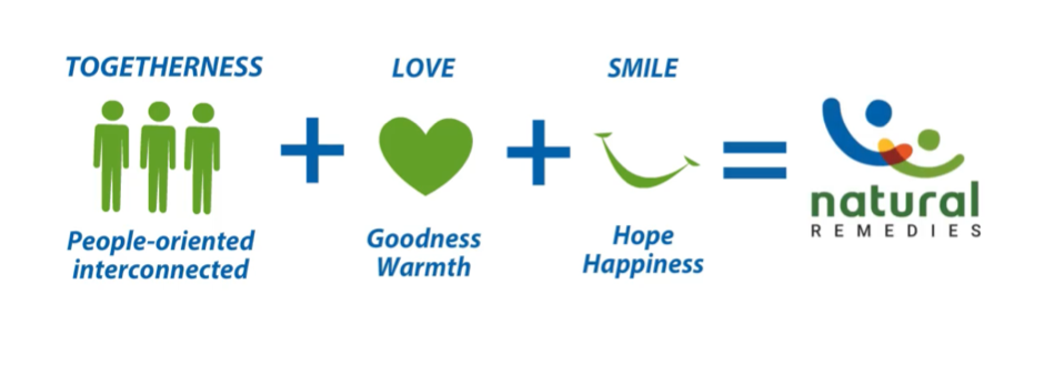
Another good example of expressing your values through your logo is this project that we did with Natural Remedies. They are India’s leading herbal healthcare company. Their core values include togetherness, love, and happiness and it is these elements that helped us craft their logo.
2) Is it easy to identify/ recall/ memorable for the target audiences? Does it bring salience to its brand?
“Symbolize and summarize.” – Saul Bass
Another factor to keep in mind when creating a logo is that your logo should leave a lasting mental impression. How easy is it to remember your logo? Some of the best logos are the simplest ones. As Lindon Leader said, “Great design is born of simplicity and clarity.”
So how do our minds retain logo information? Our brain processes images in different parts of the brain. The stages include first recognising the basic physical elements of the image, grouping them and then ultimately associating them with past experiences. The last part of this process is what encourages people to act on what they see. For example, people may associate the McDonald’s logo with hunger. When they see those golden arches, their first response would probably be to crave french fries or a Big Mac. A logo that is too complex would be more difficult for the brain to process and retain, while a slightly simpler logo would be easier to make sense of and remember. Fashion brand Chanel’s logo is another example. It’s easy to remember and conveys the brand’s dedication to minimalist fashion designs.
Yet another example is the logo we designed for Havells. It effectively brings out the energy, dynamism, and the global leadership of the brand. It also resembles the letter ‘H’, making it easy to remember. When you are choosing the right logo for your company, try to keep it as simple as possible without diluting your brand identity.
3) Is it differentiated in its category? Does it stand out in clutter?
The market is flooded with companies and ventures. Although each of them has their own unique brand identities and messages, it can be difficult to stand out from the crowd. So while your logo should be simple, it should also stand out from the clutter.
One particular issue you may face is that companies which sell similar products to similar target audiences may end up creating similar logos. Limitations in colour, form, symbolism, culture, and trends also lead to similar logos being created. That being said, there are some logos that broke their category clutter. One of the best examples of this is Apple’s logo. There are so many stories around why Steve Jobs chose a half bitten apple as the company logo – ranging from myths about his time as an apple farmer to a play on the word ‘byte’. Whatever the reason, the bitten apple really stood out from their competitors, like IBM, who opted for more dry and serious looking designs. The logo conveys two things: creativity and personalisation which fits in very well with their brand identity.
4) Is it adaptable across touch points, backgrounds, materials, and applications (mobile icon/ favicon to stationery to marcom collateral to branded merchandize to packaging to signage etc.)?
One factor that is frequently overlooked is adaptability. Remember that your company’s logo will be used in numerous places. It will need to be printed out in various sizes and on different materials. So sure, your logo looks great on a billboard but does it also look great on a visiting card?
The Nike swoosh is a great example of a logo that retains its memorability wherever it is displayed. You’ll find it on their shoes, their clothes, on billboards and hoardings, their merchandise and you will always know that it’s Nike.
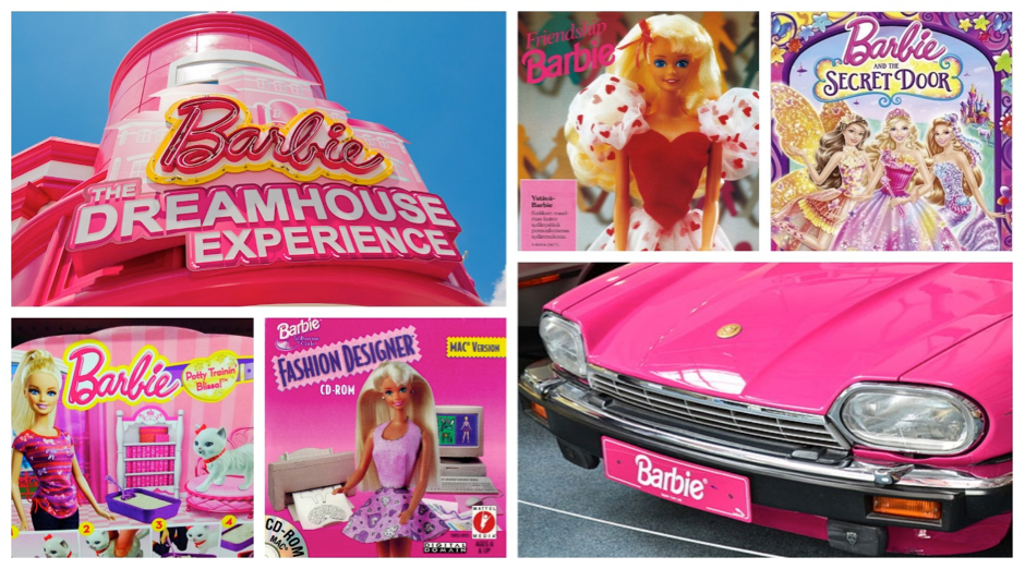
The Barbie logo, although extremely simple, is also easy to recognize and works across different touch points. You’ll find that the logo seamlessly fits into movie posters and other printed materials, stationery, product packaging, apparel and even the website.
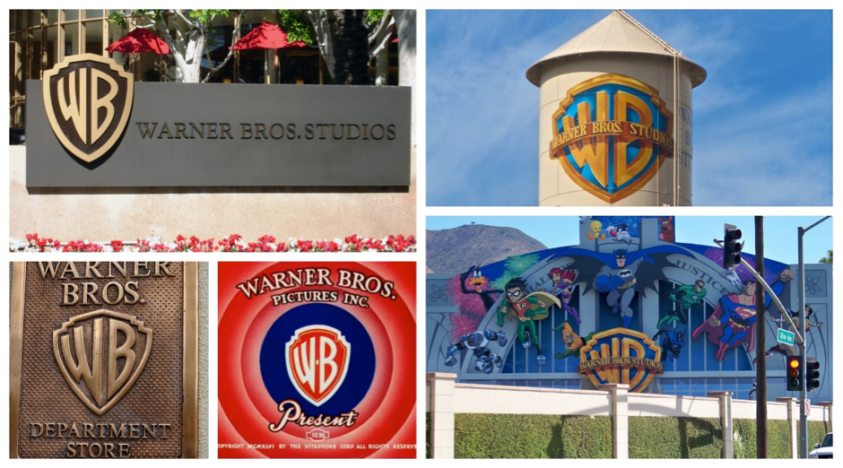
Warner Bros have also used their logo across different touchpoints without losing out on the memorability factor. Whenever you see that logo, you know exactly who it is.
Like these brands, there are so many awesome logos that automatically make you recall the brand regardless of where they are used. Sony, Kingfisher, Nestle, Cadbury, Adidas, and Dabur are a few more examples.
5) Is it ownable/ available/ protectable within (and even the adjacent) the industry (product categories) and target markets (geographies)?
Intellectual property rights have gained importance in the international business environment, including in India. For your logo to truly represent your company, it should ideally be safeguarded by law. Logos and designs used as brand identities are protected as either trademarks or are copyrighted. Both these processes imply different things. A copyright is a cluster of several rights granted to the owners of the design and mainly prohibits any form of copying, such as using the logo on products. On the other hand, a trademark is visually represented and differentiates a product from its competitors.
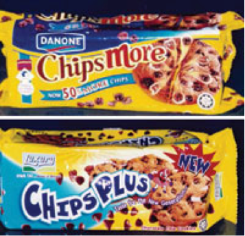
Ignoring the ownability of your logo or ignoring the similarity of your logo to that of someone else’s may have dire consequences. A business may end up spending a lot of money in damages/ litigation if the logos infringe on such intellectual property rights. An example of this was the tussle between two chocolate chip cookie companies in Malaysia, namely Danone’s ‘ChipsMore’ and Hwa Tai Industries ‘ChipsPlus’.
The court expressed that the Hwa Tai’s product’s logo was visually, phonetically, and semantically identical to that of Danone’s and that the latter company had already created substantial goodwill within the country. They concluded that ‘ChipsPlus’ was too similar to the Danone product and could hurt its sales by confusing customers. Hwa Tai was asked to stop manufacturing ‘ChipsPlus’.
One can say that a logo is like the face of a company. And as we saw, consumers are motivated the most by their vision. By keeping these 5 parameters in mind, you can ensure that your logo is a true embodiment of your brand’s values and identity, easy to remember, will stand out from the crowd, will be easy to reproduce over various mediums, and will be protected by the law.
Want to design a strong logo for your brand? Write to us on info@lokusdesign.com.

