10 Packaging Structures that caught our eye
Packaging is a core part of building and creating a brand image with the end users. The packaging of the product is the first point of contact the brand has with the customer. An impressive packaging helps in creating a brand impression in the end user’s mind which elevates brand recall during a subsequent purchase.
While keeping in mind attractive packaging strategy, a brand needs to tread carefully. You wouldn’t want to overdo it. A simple, but memorable packaging can prove attractive and a too-clever-by-half experiment can be damaging to the brand’s image. Remember, the key is to stay aligned with the core values and Purpose of the brand -the packaging should visually represent the same ideals that it reveals in everything else that it says or does.
A good packaging does two things:
- States what the product is without much ado
- States the brand’s core values
A good packaging is an amalgamation of these two. Having said that, let’s look at some examples of innovative, memorable packaging designs that do all that and more!
Here is a list of 10 creative packaging structures that caught our eye:
Spine Vodka
Source: https://www.designisthis.com/blog/post/votka-spine-johannes-schulz
Spine Vodka is high quality vodka with a refreshing and creative bottle design. The bottle is designed by German designer Johannes Schulz. The packaging subtly communicates the message that it’s a brand with a ‘backbone’.
Delicious Milk Soap
Source: http://www.thedieline.com/blog/2014/10/1/stitch-bears-delicious-milk-soap-pops
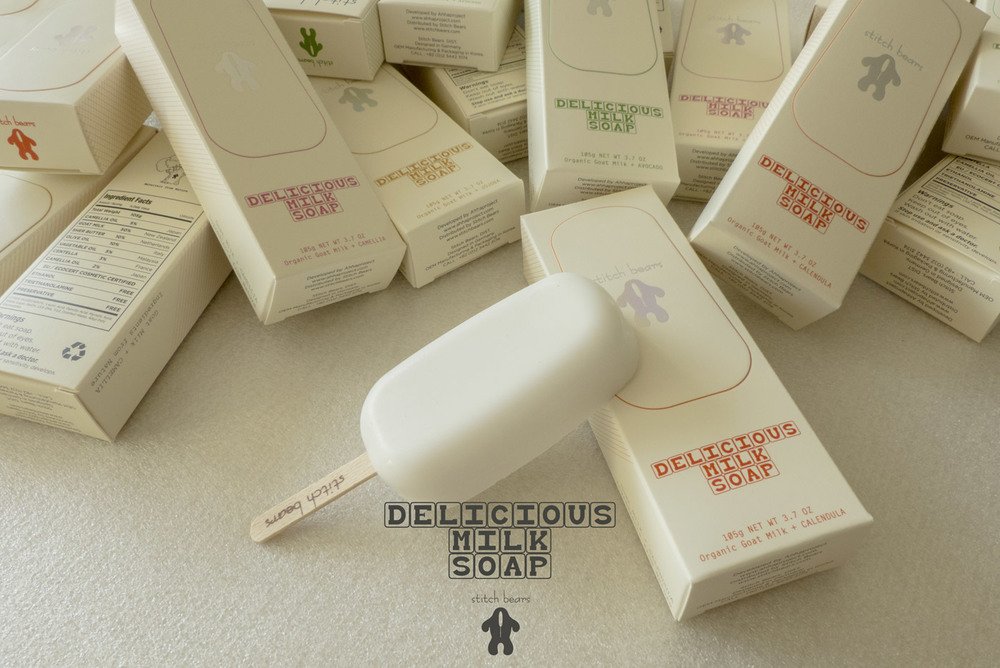
The Delicious Milk Soap caters especially to infants and babies. Made out of pure goat milk, the company took to this creative design to communicate the message of purity. Designed as an ice-cream bar, it implies that it’s so pure that you can eat it!
Thelma’s Cookies
Source: https://www.packworld.com/article/food/bakery/cookies/oven-box-design-delights-thelmas-treats
Freshly baked oven cookies delivered in an oven box! How innovative is this idea. The packaging simply communicates what the brand is doing.
Nike Air
Source: http://www.thedieline.com/blog/2013/6/17/nike-air-packaging-concept.html
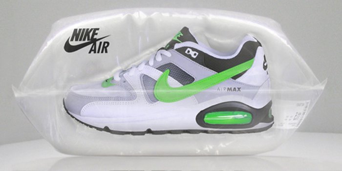
Nike is known for its top quality shoes and innovation. It took the innovation a notch higher when they launched their Air collection. They ditched the regular cardboard shoebox and packaged the shoes in a bag of air!
NYC Spaghetti
Source: https://www.alexcreamer.co/nyc-spaghetti/
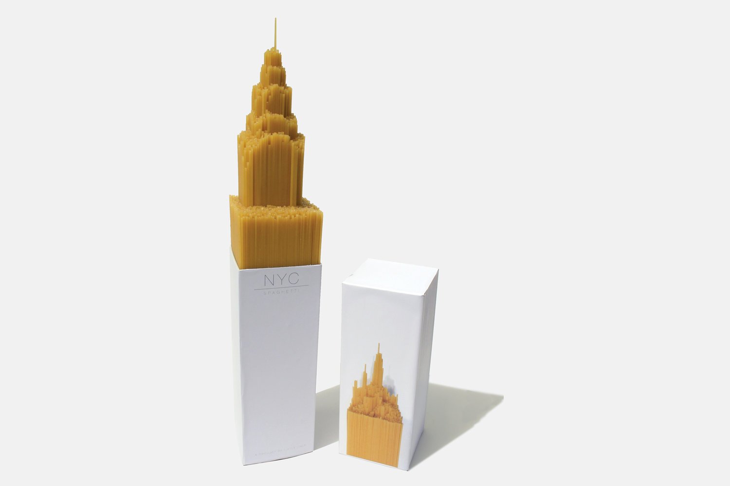
This is the most innovative product packaging we came across. The award winning design was designed by Alex Creamer who designed the bottom of the box in the shape of the Empire State Building which forced the spaghetti to emerge from the box in shape of the Empire State Building -an NYC icon like no other.
Hanger Tea
Source: https://www.pinterest.com/pin/608408230879589009/
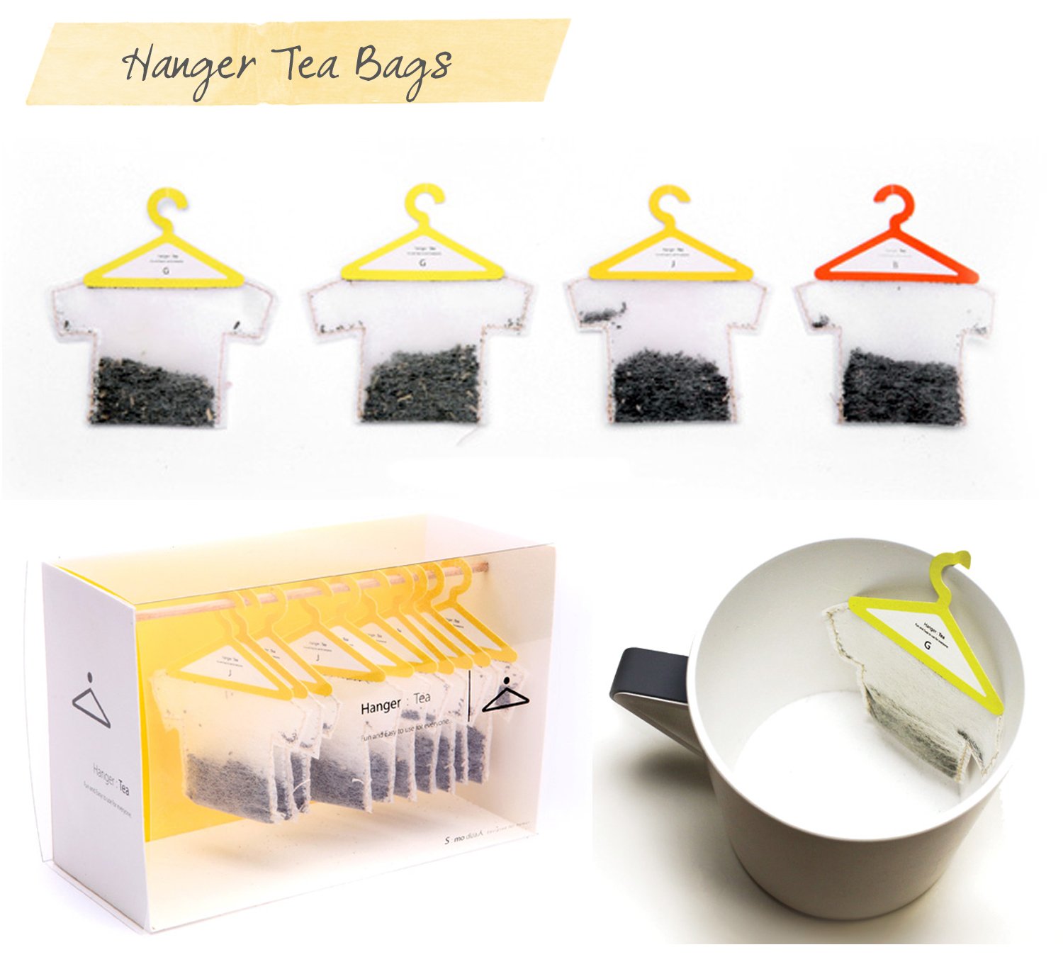
How annoying it is when the tea bag slips into the tea cup and you have to fiddle with a spoon to take it out? Well, Hanger Tea has a perfect solution for you. The packaging is not only cute and innovative but is designed to address this problem. The tea bag hangs comfortably at the edge of your tea cup making it a hassle free experience. The packaging references a dryer line at a laundry to make the association amply clear.
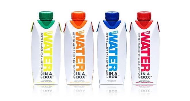
Water in the Box
Source: https://www.foodbev.com/news/water-in-a-box-from-vivid-waters/
This packaged water company addressed a lot many issues with this innovative packaging. Firstly, it broke the stereotypical ‘water bottle’ image. Who says that bottle has to be made out of plastic? And, by breaking that stereotype, the company adopted a ‘no plastic’ eco-friendly approach. It’s refreshing -and it’s in a box, even while being out of the box!
Zen Bamboo Perfume
Source: https://igormitin.com/ZEN
This is a brand that believes in letting your packaging communicate what your product is. Zen Perfume took this to the next level by designing a Bamboo perfume bottle that looks like a stem of living bamboo!
Green Berry Tea
Source: https://www.behance.net/gallery/430557/Origami-Tea
Who says a tea bag has to be a boring square? Green Berry Tea experimented with the design of their tea bag and came up with this beautiful design that allowed the tea to take wing.
3M Solar Earplugs
Source: https://www.behance.net/gallery/21262041/3M-Volume-Down-Packaging
The product is an earplug for those forced to work around loud noises -their need is to “turn it down”. The subtle design made this need clear with an innovative volume knob. To open the bottle, you need to turn down the volume. Now that’s what creating an impression with minimalistic design means.
Impressive packaging is as much about design as it is about what makes the product what it is. These great examples show that when the two factors come together the result is spectacular.
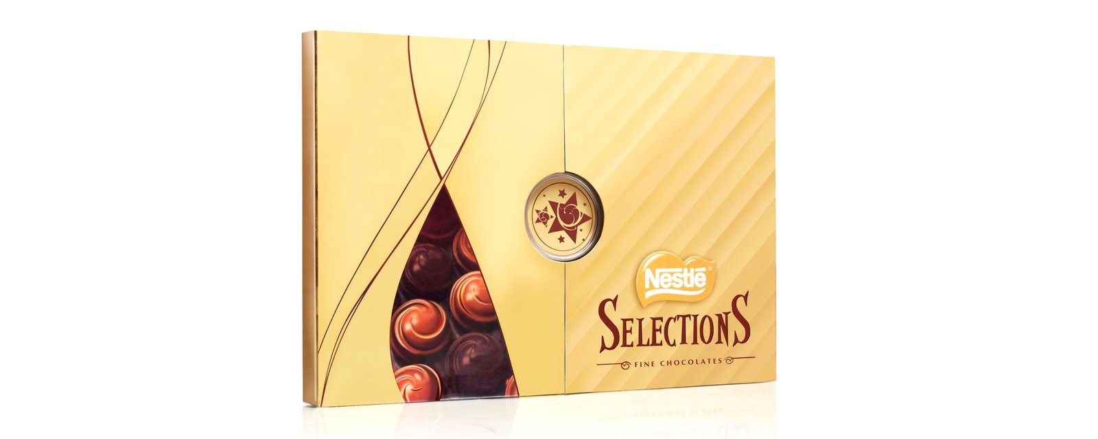
And at Lokusdesign, this has been our own experience too. Some time back, we were commissioned by Nestlé to design a premium gift box for their Selections chocolates.
What does the experience of gift giving and receiving constitute of and feel like to Indians? And what role does packaging play in this? This was the start point of our partnership with Nestle towards designing a premium gifting experience for their Selections chocolate box.
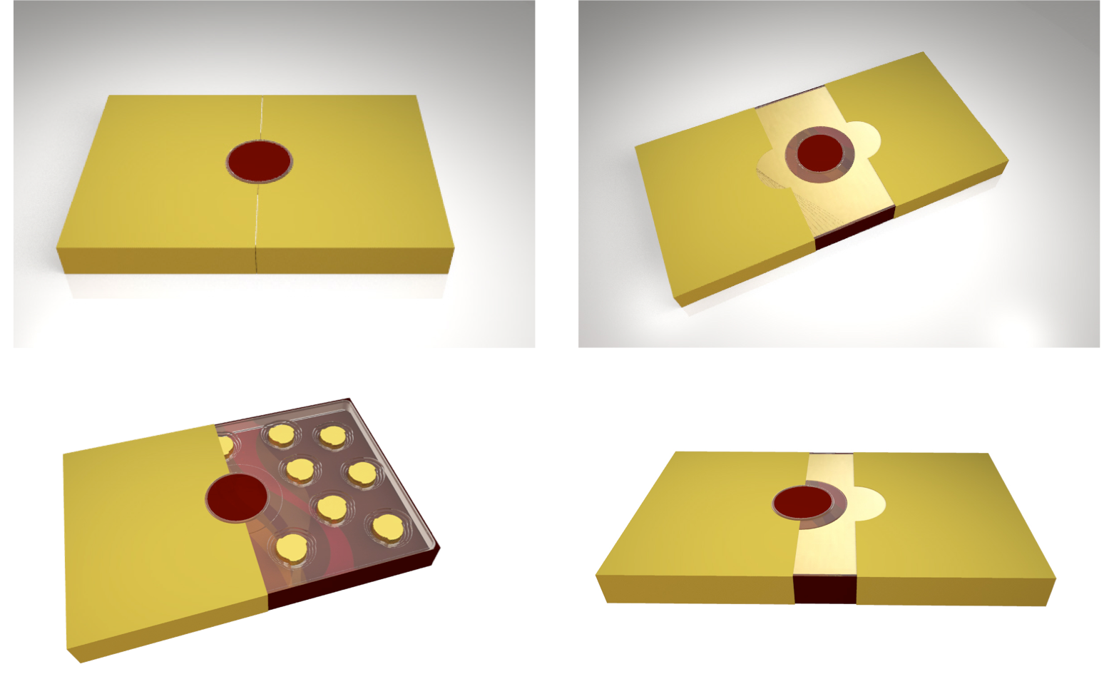
Our insights helped us break the monotony of chocolate gifting in India by way of a concept, which was centred around a ritual that built curiosity and anticipation into the whole gift giving- receiving- unboxing experience. The design struck a perfect balance between Nestle’s international brand image and India’s cultural sensibilities.
Our engineers perfected the gift box to the finest aspects, eliminating rattling of chocolates from the inside and distortion of the box from the outside while our designers developed stunning graphics to deliver a truly premium experience.
 Keen to design clutter-breaking packaging for your products as well? Write back to us on info@lokusdesign.com.


