6 recent F&B Branding stories that will catch your eye…
The food and beverage industry is among the most difficult places to thrive in. In India, economic development and supportive government policies have resulted in a higher demand and supply of innovative F&B solutions. With a spike in demand, there’s been a high rise in production, processing, distribution, and the marketing of F&B products in our country. As far as manufacturing goes, F&B is now the fifth largest sector, and the Indian food processing sector received FDI worth $7.8 billion, making it one of the most heavily funded sectors in the country. India has also become a hub for the production of processed foods. So what does all this development mean for brands? Cutthroat competition! Having an exceptional product isn’t enough, you have to sell it, and to sell it you have to tell your unique story.
There are plenty of quality products out there and customers have so much to choose from, it’s up to the brands to give customers a solid reason to not take their business elsewhere. If you stand out, you have a lot to gain. So what can you do to stand out? Here are 5 recent Indian F&B branding stories that caught our eye:
RAW Pressery
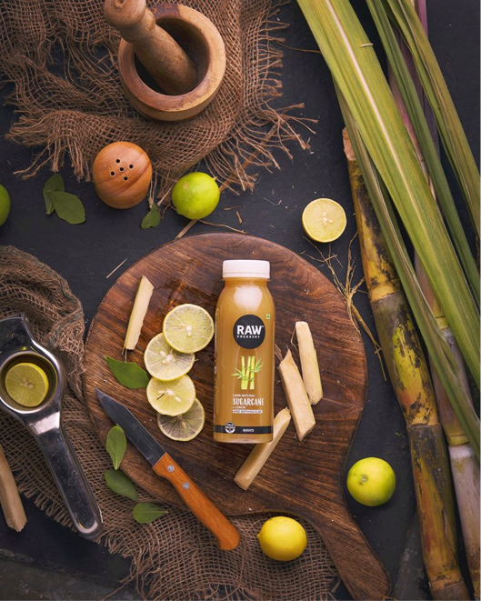
Born in 2013, this brand was first imagined out of necessity. The founder Anuj found his kitchen ceiling splattered with carrots and asked himself why healthy habits had to be so complicated. Armed with a Norwalk cold press juicer and a drive to create healthier habits, Raw Pressery was born. The core value of this brand is “all good, no bad”, and this stands out on their subtle but effective packaging. The way the ingredients are listed also highlight the the same. All brands usually resort to fine print when it comes to nutritional labels but Raw Pressery does the opposite. They do not shy away from their message, and the ingredients are listed on the forefront of the body, one below the other with a last line that reads “and nothing else”. If you follow them on Instagram, they’ll show you how to reuse the plastic bottles as little planters because they’re all about “all good, no bad”.
80% of their packaging is transparent so that you can see the ingredients such as chia seeds, which also is in synch with their transparency and brand promise as a company- to bring you “all good, no bad” juices. Once they picked up the pace, their first outdoor campaign was an extension of “all good, no bad”. A play on words, you would have noticed hoarding in big cities which said, “the fruit, the whole fruit, nothing but the fruit”. This catchy slogan went a step further to establish that besides real fruit, nothing went into a Raw Pressery juice.
Mason & Co
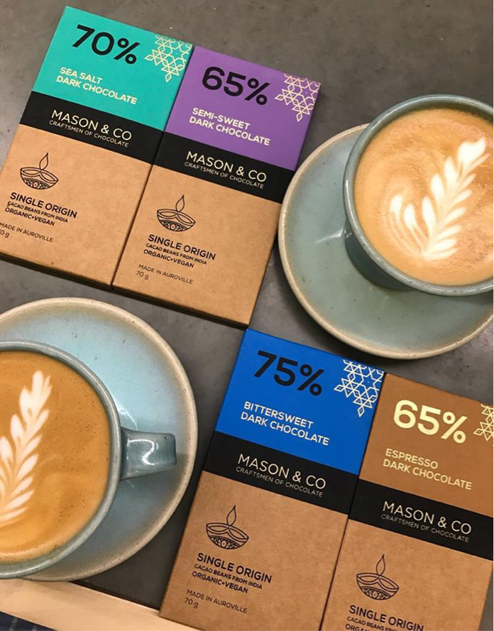
Even the biggest names in the business pale in comparision with the aesthetic, organic and wholesome bars of chocolate that Mason and Co create. Mason and Co is all about the good stuff. This homegrown brand was imagined by a couple of passionate chocolatiers who are obsessed with everything that’s healthy, natural, and delicious. On discovering that there were no local options for healthy, gluten-free, vegan chocolate, the founders decided to be the first ones in the business in India. Their clean and earthy packaging is a symbol of nature and resonates with the brand’s promise of being sustainable, artisan chocolate.
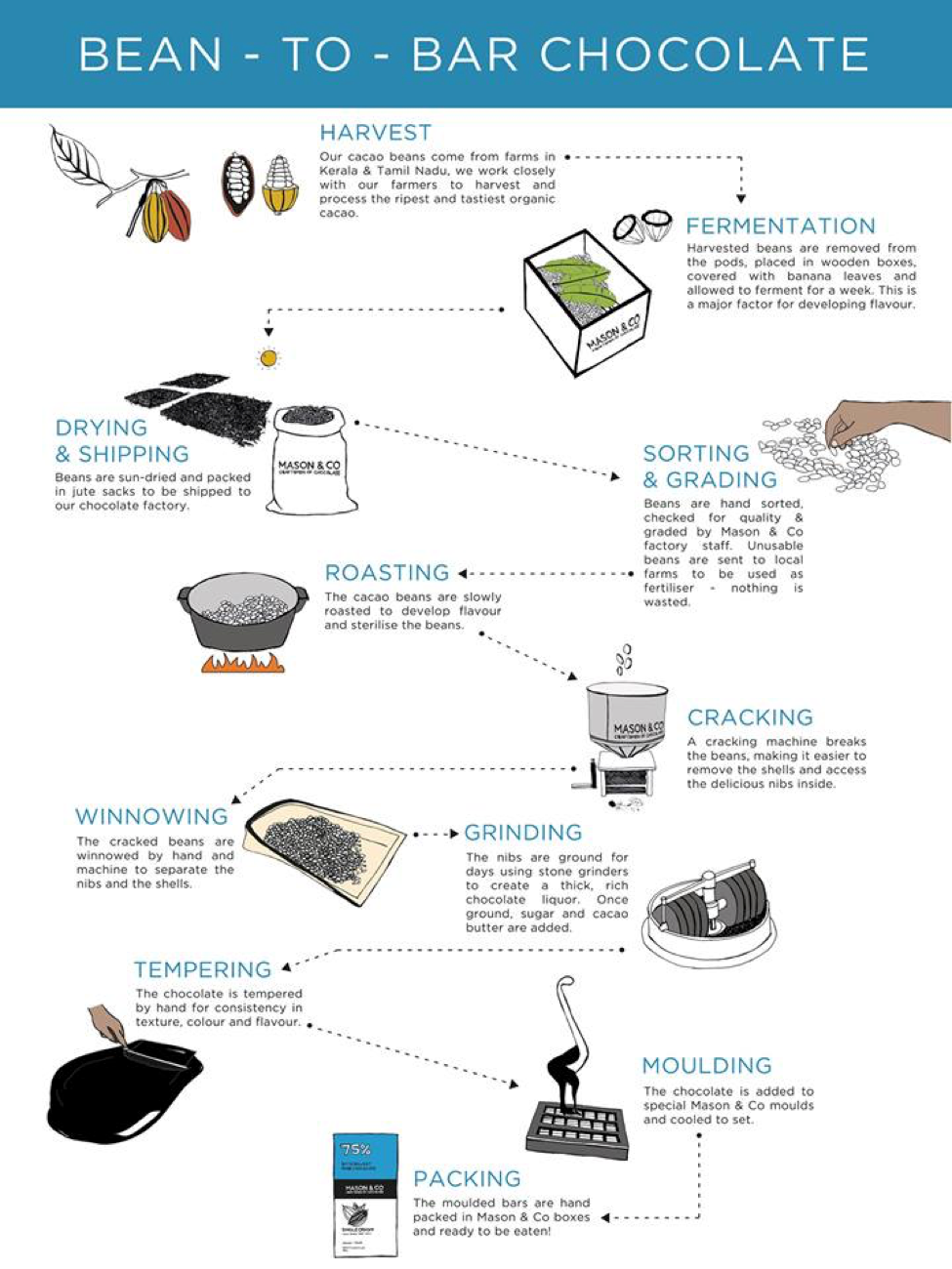
In a nation that’s obsessed with dairy, Mason and Co resorted to telling a story to educate the masses on what their chocolate stood for. The packaging on each bar educates the consumer on how the bar is fair trade, organic, and vegan. The branding tells the story of the lush cacao farms in Tamil Nadu and Kerala where their local farmers source the choicest beans to make the best chocolate. They also switch up the packaging according to seasons and themes!
There’s a neat little space behind the packaging which will tell you the story of how the cacao beans are sourced from small organic farms in the South, and how each bar is made using the artisan bean to bar process. Their clean and earthy packaging is a symbol of nature and live up to the promise of being sustainable, artisan chocolate.
Fassos
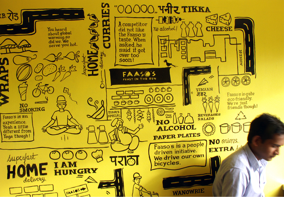
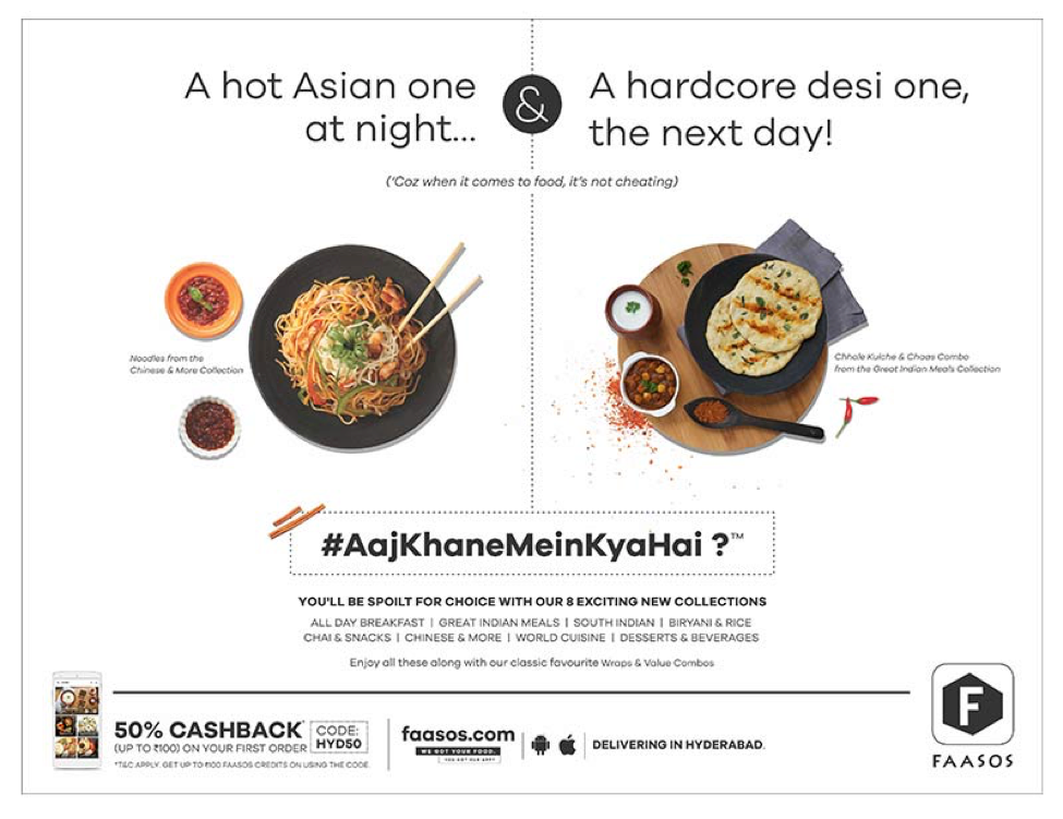
It’s not easy to go from a small outlet in Pune that was bleeding money to a company that receives over 10,000 orders a day. The Fassos success story is like no other. From the signature purple and yellow, desi style collaterals to the clean, upscale Fassos design that we know today, we can all learn a thing or two from Fassos. The initial message of the brand was desi fast food. The menus, packaging, and the website was all a reflection of this message. From quirky, Indian street art on the boxes to catchy taglines in the outlets, everything about the branding was typical Fassos. However, with the emergence of competition such as Box 8, Fassos knew that something had to change.
Enter rebranding! From new and improved menus to a sleek, clean design that would win back the market share, Fassos managed to get it right. The new packaging was a reflection of a new brand promise- desi fast food with a contemporary twist, for the urban palate. The clean, minimalistic design is also in synch with their new menus which have been introduced by ace chefs in the country. The brand switched it’s positioning from being a desi joint where you could indulge in delicious wraps on the go, to a desi brand with a contemporary twist where you can indulge in global cuisines with an Indian vibe, and every single collateral, from the menus to the social media communication to the packaging reflected this change.
Dinshaw’s
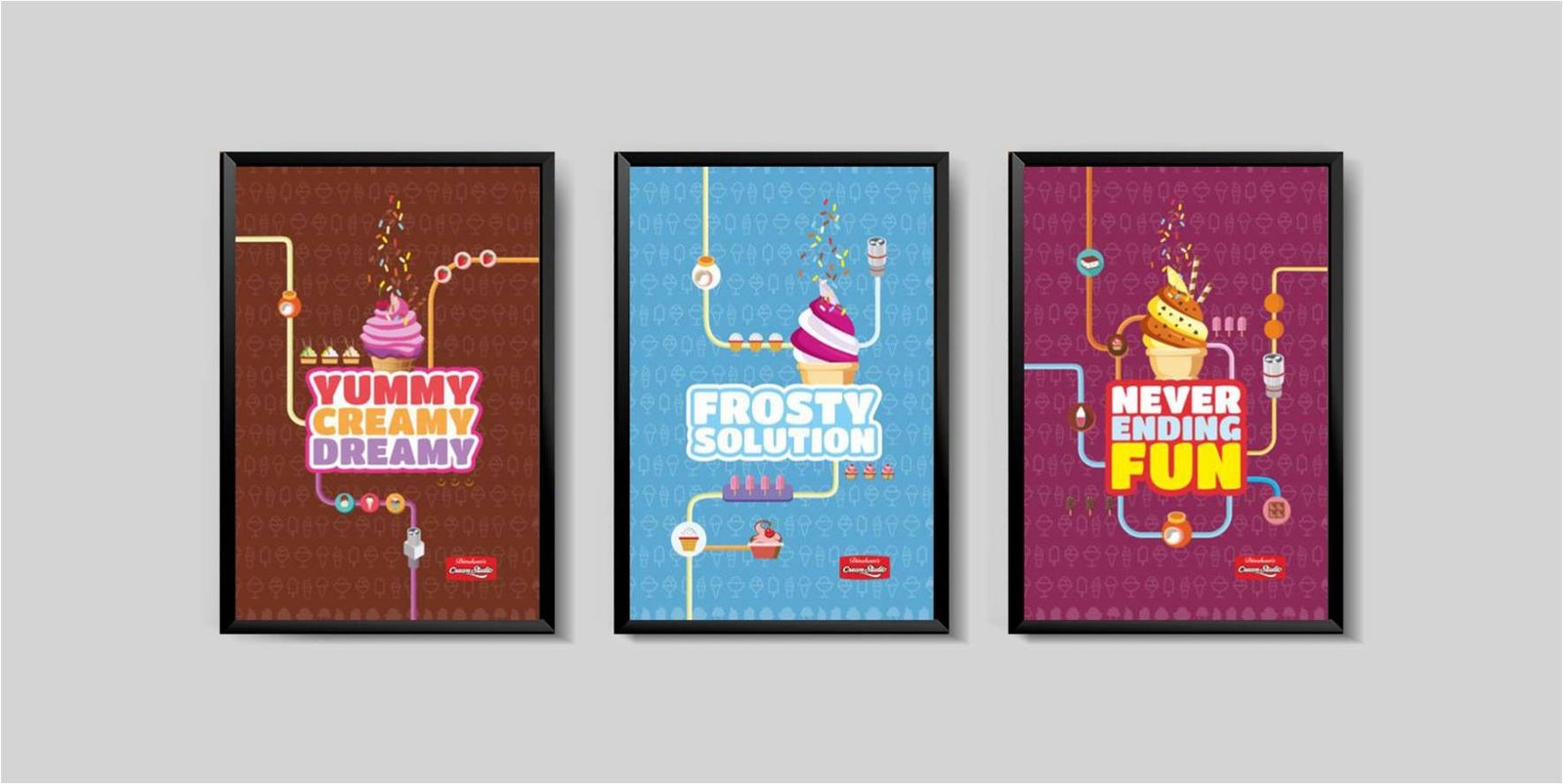
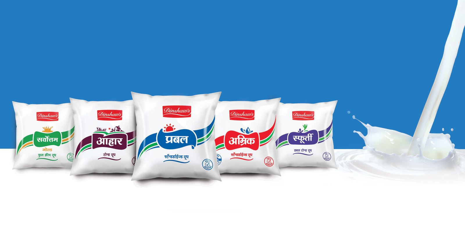 Dinshaw’s has been a household name in central India for decades. With changing times however, the brand felt a strong need to relook its impression on the hearts and the minds of its customers. The entire shift in Brand Strategy, however, was driven inside-out, and was strongly anchored in the brand’s inherent commitment to “goodness”.
The entire design exercise that followed also drew heavily from this- with the purpose of making people feel cherished. The rebranding enabled Dinshaw’s to maintain its mass appeal while still making it feel aspirational for its target customers. It helped the brand stand out distinctively in a cluttered retail context. A conscious attempt was made to rationalise the brand architecture and packaging design in a way that drove maximum efficiencies in the overall marketing/packaging spends.
Blue Tokai
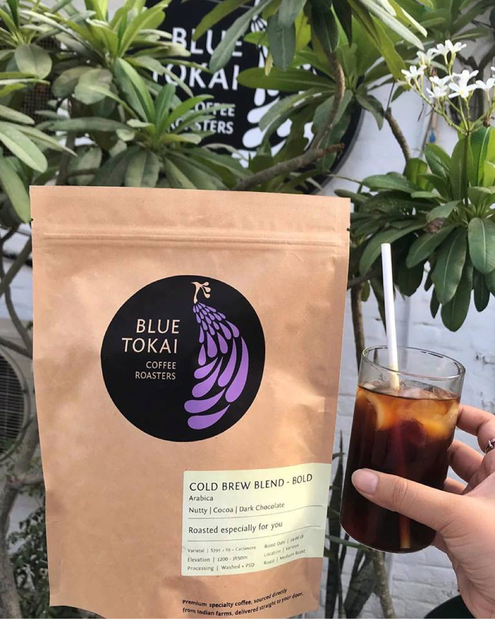
The coffee roasters at Blue Tokai are reaping in the rewards after they have created a name for themselves by being very good at what they do, and by letting the world know through good branding. From being available online to having their own flagship stores and custom cafes, and tie-ups with other brands, Blue Tokai owes it all to their dedicated focus on customer experience and education. This is made possible through great branding. Their packaging is rustic and simple, with personalized messages on each pack. Effective communication and the most aesthetic flatlays resulted in Blue Tokai being a massive hit on Instagram. The logo is an abstract tail of the peacock because “Tokai” is the Malabari word for the tail of the peacock. The story behind “Tokai” is one of the first things you will see on the website. The “Tokai” is to represent the pride of India. The founders wanted to give the Indian market freshly roasted coffee which was homegrown, as compared to buying imported coffee made from beans grown in India. This is why you will see the peacock tail on all of their branding.
Earth Loaf
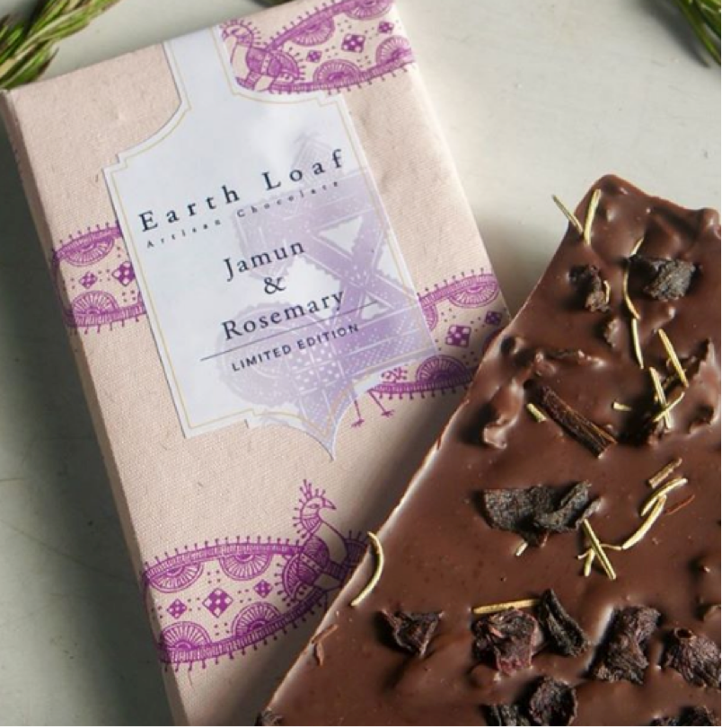
An exceptional homegrown brand, Earth Loaf is a premier, gourmet, artisan chocolate brand. These guys are doing it right, from versatile, Indian inspired flavours to healthy, organic ingredients. This vegan brand boasts an array of unique flavours, and each has a backstory like Mysore Pak Nouveau from their collection, The India Story. Everything about this brand is earthy, even the name itself is like a slice of Earth – Earth Loaf. The brand promise is to create innovative, healthy chocolate for the Indian market, and they’ve done just that. From candied mosambi to Malabari Forest, the flavours of this brand are nostalgic journeys by themselves. Made with love in India, our national bird stands tall on every bar. Through its packaging, Earth Loaf blends art, culture, and nostalgia with a decadent chocolate experience. Earth Loaf caters to a refined audience because you will only pay that kind of money for a bar of chocolate if you understand the health benefits and the sustainability of it. This is what Earth Loaf banks on, and a lot of their communication is a reflection of this.
Want to leverage design to drive a strong impact for your F&B brand? Drop us an email at info@lokusdesign.com and we would get back to you soon!

