7 Logo Design Failures Every Brand Should Learn From
It is undeniable that a great logo is a powerful marketing tool. It not only gives a brand an easy to recognize identity but also communicates volumes about what the brand stands for, what its values are, and what it has to offer. We have written in the past about the factors brands must consider while creating truly effective and evocative logos.
The first feature of a great logo is its ability to grab a viewer’s attention almost instantaneously. The logo should be striking enough to hold the viewer’s attention. However, catching the viewer’s eye does not necessarily mean that a logo design is great. There are several other factors that come into play. A great way to learn is to look at some great brand logos and what they conveyed -and there’s much of that in one of our older posts here.
But an even better way to learn is to look at logos that didn’t work -and that’s what this post is about. Let’s take a look at 7 prominent logo failures. That could help you avoid the mistakes that these brands made.
1) Gap:

In 2010, Gap suddenly changed its logo without warning. Among other things, the suddenness that made their customers cringe. Gap’s logo had always been quite iconic- GAP written over the navy-blue square. The new logo pushed the navy-blue square in the corner and made it rather tiny. There’s more about this fiasco here. It was not long after they made this horrible mistake that they realized how much their customers connected with their logo. After an unprecedented outcry from their customers, Gap sought to make amends. They asked their fans for suggestions on how to rectify the logo. In a matter of a mere 6 days, Gap returned to their original logo design. All’s well that ends well -and never mind the tiny Gap in logo continuity.
2) Kudawara Pharmacy:
![]()
An unintentionally infamous Japanese company by the name of Kudawara Pharmacy decided to get creative with their logo. They played around with the alphabet ‘K’ in their logo and tried to bring the people they served into their rather plain looking “name-only” logo. Their innocent attempt to innovate soon backfired when the positioning of the “people” in the design made the logo look rather raunchy. The company ran out of steam eventually, well at least they don’t function under that name or logo.
3) London Olympics:
![]()
The logo was designed at the substantial public expense of £400,000. It was intended to symbolize the dynamic Olympic spirit and its inspirational ability to reach out to people across the globe. The new emblem was created to be proactive, modern, and flexible. It was created to reflect a brand-savvy world where the youth no longer related to static logos but responded to a dynamic brand that worked with new technologies and across different traditional and modern media networks. However, it was met with skepticism and even hatred. Why was it disliked so intensely? The problem was that the logo came with too much “hyperbole, rhetoric, metaphors, and inflationist meanings.” Put simply, for an event that was inherently about showcasing the best that the country had to offer, the logo had nothing recognizably representing the UK in it all.
4) Animal Planet:
![]()
A few years ago, one of the most popular networks on TV- Animal Planet, decided to modify their logo design. From a globe with an elephant & ‘Animal Planet’, they switched to a letter-only version with a sideways ‘M.’ Not only was this hard to read but it also confused many viewers who thought the ‘M’ was an algebraic symbol. Perhaps worst of all, there was no animal in this text-only planet. Many confused and disgruntled viewers ended up on the Discovery channel. The lesson to learn here is that human beings are visual and including a specific graphic in your logo can create a strong meaning for your logo.
5) NASA:
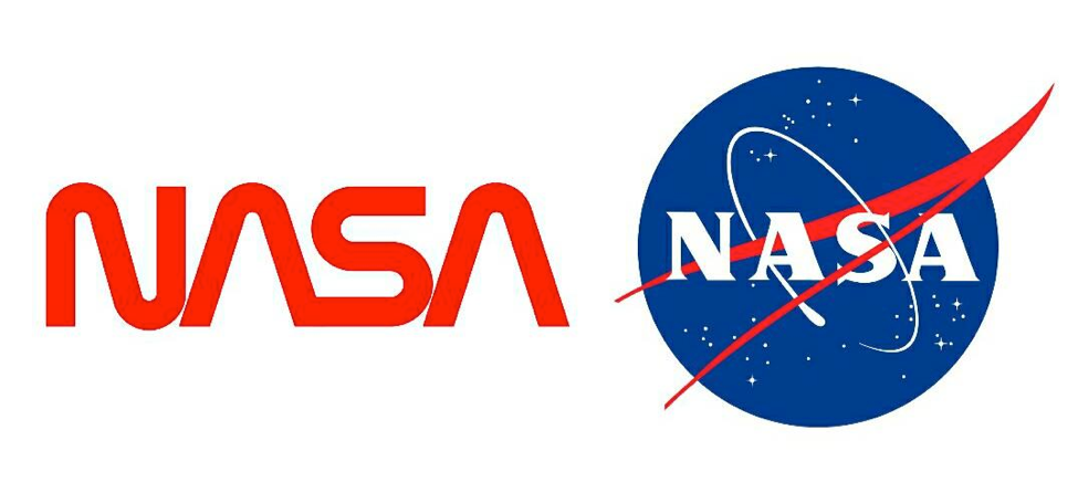
NASA decided to change their logo design from the highly appropriate design of the universe encircling NASA to a hardly legible ‘NASA’ in red font! The new logo borrowed from the extremely recognizable profile of the Space Shuttle. Despite the tremendous public recall the Shuttle enjoyed, the new logo conveyed little of the grand scale of NASA’s mission and the sheer size of their quest. However, thankfully they returned to their old logo design shortly after.
6) Kids Exchange:
![]()
Nothing proves the importance of proper punctuation and spacing in a logo more than this one. This was the logo design of the Kid’s Exchange consignment shop in Georgia. Sometimes as a logo designer, you just have to take a step back and look at your handiwork to see all the unintended consequences of what you have wrought. Thankfully, the logo was changed before the store caught too much heat.
7) Instagram:
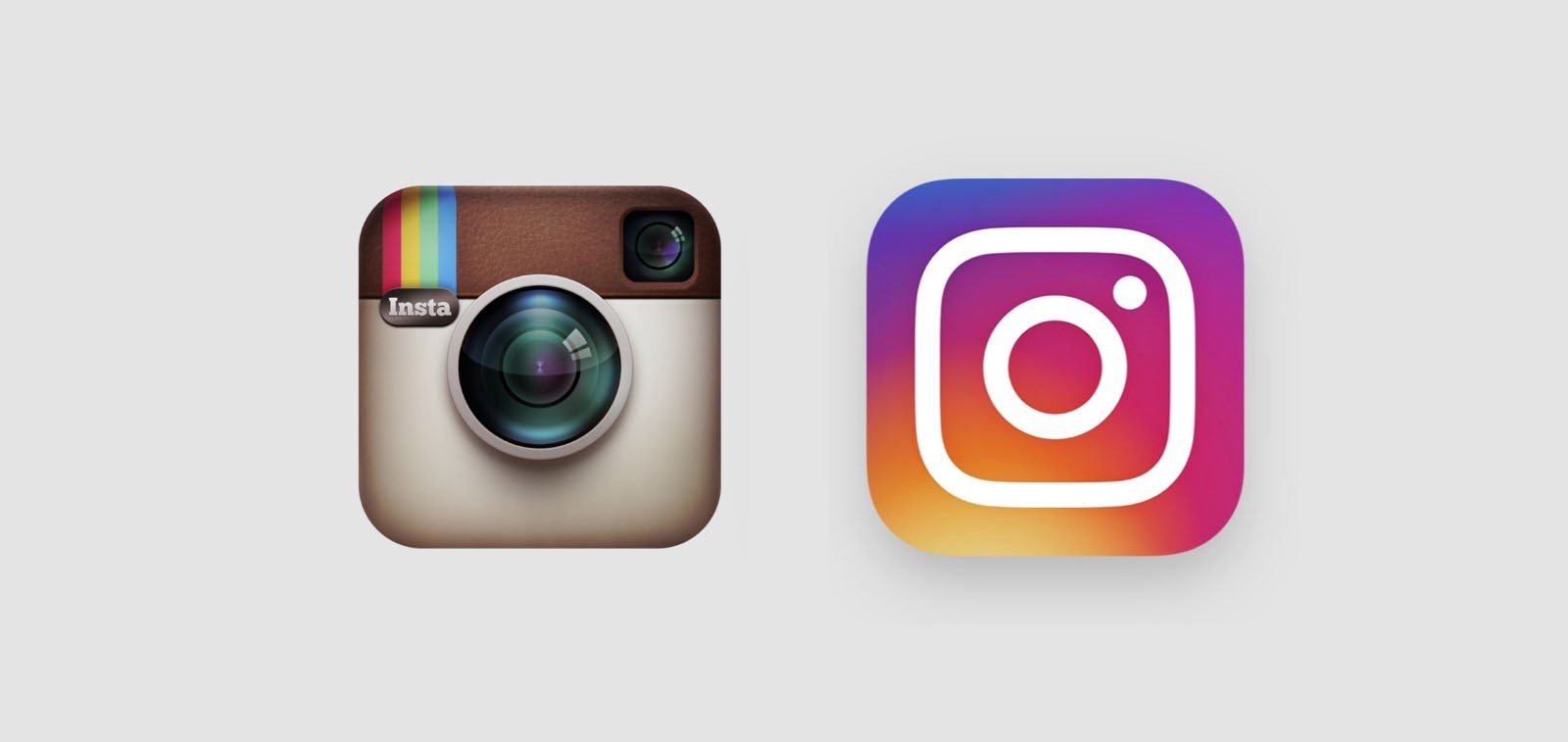
The original logo was a retro-style Instamatic camera that made everyone nostalgic for the simpler technologies of times gone by. When Instagram decided to recreate the famous logo, fans responded negatively. Many of them exclaimed that they liked the original logo better because it was easily recognizable as a camera icon and they associated it with taking photos with their loved ones. The new logo was too plain and too colour-restricted to convey the rainbow of emotions that users were trying to capture and convey through their posts. The brand stuck with the logo change though, perhaps acknowledging that their audience was overwhelmingly young and not from the “Instamatic” generation.
The key to creating a great logo design is to go inside-out. This means that first, you as a brand should understand what is it that you would like to communicate about your brand to the world. Once you have complete clarity on the ‘why’ then the ‘how’ and ‘what’ will follow. Always start from within. Your logo design should convey your Purpose in the simplest way possible. And, that’s great design.
Loooking to design a logo for your brand? Reach out to us on info@lokusdesign.com.