7 Logo Design Trends that are catching up fast…
1) Adaptable Logo Design:
This trend focuses on the visual elements that can be adapted or changed. The trick here is to be creative while maintaining the original essence of the brand’s identity. As opposed to a singular and static logo, an adaptable brand identity is more dynamic and interactive with the viewer. This trend has led to more flexible and more personalised brand identity models. An example is Snapchat.
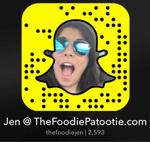
Image from https://thefoodiepatootie.com/my-snapchat-snapcode/
2) Responsive Logo Design:
The rapid rise of mobile browsing and browsing from multiple other devices has led to a usability issue for designers. Responsive layouts adjust content, layout, and imagery to the ratio and size of a screen. This makes it easy to adapt the brand identity across different mediums and platforms. For example, a responsive logo will look a particular way when viewed on a mobile phone screen and then automatically resize when viewed from a laptop screen. Check out The Whitney Museum’s ‘Responsive W’.
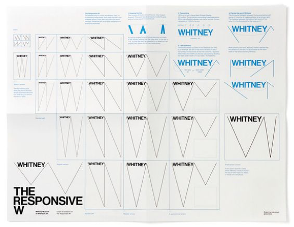
Image from Pinterest via designboom.com
3) Movement:
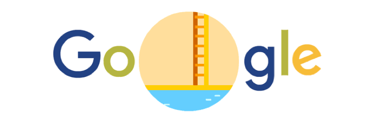
This year has seen the rise of video content on social media. Instagram Stories, Facebook Live and other ventures are turning the focus to video marketing. It’s not just video – animations and GIFs are finding their place in the visual identities of brands and they are working well in terms of customer engagement. An excellent example of movement incorporated into brand identity is the Google Doodle.
4) Bold typography:
Big and bold typography is a trend this year. Designers are combining simpler and less elaborate typefaces with bold colours, gradients, and other customisations. This creates lettering that really stands out. Here are more typography trends to look into.

5) Duotones:
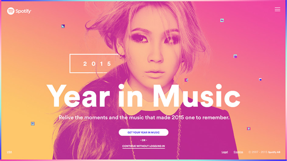
Duotones are created through a halftone printing process where one halftone is printed on top of another halftone, creating a two-toned image. One can easily create monotones, tritons, quadtones and tinted images as well. A good example of dual-tones can be found on the Spotify website.
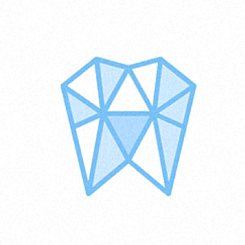
6) Fundamental Geometric Shapes:
‘Geometric logos feel modern because they use the same abstract shapes we see in modern art and feel digital because of their mathematical structure.’ – 99designs.com
Using fundamental geometric shapes cuts down on excessive design elements. These designs tend to look modern and subtle. Designs based on fundamental geometric shapes and also play around with texture. Check out this list on the various ways you can utilize geometric shapes in your design.
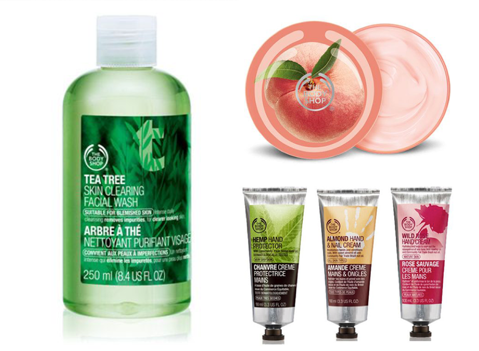
7) Specialist Printing:
A well-designed brochure, pretty packaging and other ‘real life’ printed material play an important role in creating a positive image in the consumer’s mind. This year, specialist printing is touted to be more effective than ever before. The Body Shop are pros at packaging.
Conclusion
Let’s keep an eye out for which of these 7 trends cool down, and which of these develop and grow. In the long run, trends keep coming and going with some making waves of change in the field of design. Taking into consideration the dynamic nature of the digital world, brands have to keep themselves in tune with the trends of the day in order to stay relevant. In our digital age -that may well mean a digitally-driven trend. With advancements in technology, there will be newer and more exciting ways to express your brand’s personality.
Which of these trends do you think will suit your brand best? Let’s discuss, drop us an email on info@lokusdesign.com.